

So if you’re looking for some design inspirations for your logo, it’s time to get back in shape, into geometric shape that is. The simple shapes that are used as the foundation for all other shapes are the square, rectangle, circle, oval or ellipse, and triangle. Each of them comes with a certain meaning that can be used in design appropriately.
Squares and rectangles are considered to be the most familiar man-made objects that surround us: just think of all those buildings we look at and live in, books, newspapers we read, the screens we stare at. All that helps squares and rectangles to evoke in us the feelings of comfort and safety. In design these shapes are used to suggest stability, knowledge and truth. Squares are often regarded as the most honest and trusted shapes, more so than rectangles.
Circles indicate completeness, freedom or infinity. They can be used to imply movement or security and protection. Circles and ovals are perfect attention grabbers due to their enclosing nature. Circles are considered to be the most perfect of all forms and are often used to convey the ideal choice.
Triangles are the most dynamic of all shapes. They can suggest growth, progress, action and movement. Due to their pointy nature triangles are often used in design to indicate a direction, pointing us in the right way.
All of those shapes can be combined with each other to achieve very interesting and unique designs and deliver an elaborate message. One triangle or a series of them can point to one or more directions. The shapes of one form can be grouped together to make another shape. The shapes can be used to replace letters of the same form, or vice versa, several letters together can form a shape.
The combinations and designs are limitless, just let your imagination fly. And to inspire you with some valuable ideas, take a look at how some of the well-known companies had their logos designed with geometric shapes.


 1. Circle
HBO‘s logo with a circle inside the ‘O’, simple as it is, still definitely grabs our attention.
Audi‘s four rings certainly bear similarities with the Olympic rings, correlating with the idea of four Audi companies coming together as a group – AUDI, DKW, Horch and Wanderer.
ABC‘s logo was designed by none other but the Logo Maestro himself – Paul Rand, who modified the old logo which was lowercase ‘abc’ inside a lower case ‘a’, and turned it into the current “abc circle” in 1962 by reducing each letter to its most elemental circular form.
ABC‘s logo was designed by none other but the Logo Maestro himself – Paul Rand, who modified the old logo which was lowercase ‘abc’ inside a lower case ‘a’, and turned it into the current “abc circle” in 1962 by reducing each letter to its most elemental circular form.


Ubuntu Linux logo is a perfect example of experimenting with extracting and combining the clones of one shape (circle) with the right blend of colours.
MasterCard is another prime example in using interlocking circles, this time only two, with a few horisontal lines in the middle. The logo represents MasterCard Worldwide with its reach for a global audience.
BMW logo is using the Bavarian national colours of black, white and blue. In 1942 Wilhelm Farrenkopf, the Advertising Manager, has described the logo as the shining disk with the “shades of the engines, two silver divides and bright blue gleams that represent the sky”.
2. Oval


 Ford‘s distinctive oval logo was first introduced in 1907. The oval was designed to promote the company’s “hallmark for reliability and economy”. By 1911 the script lettering was added to represent the company’s name. Since 1976, the blue and silver Ford oval badge, called “Centennial Blue Oval” has been already used on all Ford vehicles
Toyota‘s corporate logo is one of the instantly recognizable car logos. In 1936 Toyota announced a competition to come up with a logo design for the company that will communicate “the feeling of speed”. Two perpendicular ovals form a “T” for Toyota and the third oval around it symbolizes the company’s global expansion and infinite prospective future.
It wasn’t an intention to showcase only car logos in the Oval category, but looks like elliptical shape that conveys movement is favored by many car manufacturers, including Kia Motors.
3. Triangle


The four red and two white triangles form a hexagon for HSBC‘s logo. It was based on The Hongkong and Shanghai Banking Corporation’s XIX century house flag – a white rectangle divided
diagonally to produce a red hourglass shape. The company’s flag itself descends from the Scottish flag based on the cross of Saint Andrew.
Motorola‘s stylized “M” logo was designed in 1955. The two upwardly directed triangles promote the company’s bold leadership and innovative spirit.Did you know that you can extract three triangles from one big one by simply carving a small triangle inside, the way Triple Triangle Inc., a leading provider of plug-in products for Adobe InDesign, designed its logo.
4. Diamond

 Three diamonds in Mitsubishi logo were chosen by Yataro Iwasaki, the founder, due to several reasons. The company name itself is a combination of the words “mitsu”, which means “three”, and “hishi” (which Japanese often pronounce as “bishi”), which denotes a rhombus or diamond shape. Iwasaki’s family crest was an image of three stacked rhombuses and Yataro’s first employer’s dynasty had an emblem with a three-leaf flower.
Renault too has an interesting story behind its logo. Originally the company started out with a circular badge, that was placed on the horn. In 1922 the centre of the badge was cut out to allow the sound to escape, and by 1924 the badge took the modern diamond shape. A new typeface Renault was designed for the company only because at a time it was cheaper to design a new typeface than use an existing one.
The Opus Group is a multi billion real estate development company, and its logo has been designed to use diamonds as building blocks to shape up a three dimensional image of the corporation.
5. Square / Rectangle


 What I’d like to know is how much money did the multi billion company, the leader in tax preparations worldwide, pay to design the logo for H&R Block – a simple green square, a.k.a block, an obvious graphic representation of the company’s name. Nevertheless, it just shows you that you don’t need to come up with intricate designs for your logo – simply choose one of the basic geometric shapes, a color a classic typeface and start offering tax services, or at least don’t forget to pay your taxes.
In 1972 Deutsche Bank has commissioned eight graphic artists to design a logo that should be able to distinctively represent the company. The winning logo was Anton Stankowski’s the “slash in a square” with the company’s name set in the classic typeface Univers. The slash represents the bank’s consistent growth and dynamism, and the square is a sign of security and trust.
BBC‘s famous logo with letters in boxes was introduced way back in 1962. Initially the boxes were squares and the letters were slanted. Later the logo evolved to the one with slanted boxes, until the final modern version straightened the sides from their 17.5-degree slant, and the typeface was changed to Gill Sans.
BBC‘s famous logo with letters in boxes was introduced way back in 1962. Initially the boxes were squares and the letters were slanted. Later the logo evolved to the one with slanted boxes, until the final modern version straightened the sides from their 17.5-degree slant, and the typeface was changed to Gill Sans.
As you can see, all three logo cases above fulfill the main criteria required for a high quality brand:
- their simple yet striking forms are timeless
- free of any fashionable accents the logos can be implemented in all media
- they are all still clearly recognised when reduced in size and at great distances
- their simple yet striking forms are timeless
- free of any fashionable accents the logos can be implemented in all media
- they are all still clearly recognised when reduced in size and at great distances


I’ve previously written about National Geographic‘s striking yellow box in my post 8 Bits Of The Most Brilliant Advertising Campaigns, and about SUN‘s clever ambigram in my post on 8 Clever Logos.Columbia Sportswear Company‘s logo bears a slight resemblance with SUN’s logo, however it’s not an ambigram, just a neat crosshatch pattern. Both are great examples of forming a familiar geometric shape with the use of other forms or letters.
6. Cube / 3D


Nintendo GameCube logo is a cube with several optical illusions. It actually includes two cubes, a ‘G’, and a ‘C’.
Sony Ericsson logo is everything you’d expect it to be to represent the joint venture of two giants – Japanese consumer electronics company Sony Corporation and the Swedish telecommunications company Ericsson to make mobile phones. You can even practice creating this futuristic logo yourself by following a tutorial from pscloud.
Wikipedia’s Puzzle Sphere design is as famous as the website itself. It represents Wikipedia’s global audience as well as all those translations of the online encyclopedia to 253 foreign languages
7. Mixed / Combinations


Adobe‘s current logo didn’t always look like that, however the triangular shape of the first letter A from the old logotype was carried to the new design.
We can either love or hate AOL, but the attractive simplicity and the instant recognition of its logo with a sphere carved into a triangle, is indisputable.
Sometimes a union of two very different shapes like a rectangle and a circle can produce amazing results, and become very successful, just like it was in the case with HP‘s logo and the company’s founders – Bill Hewlett and Dave Packard.

 Mercedes Benz logo symbolizes the three different directions the company was taking when manufacturing transport means for air, water and land. It also resembles a steering wheel and along with its silver color it makes this car to be a desirable target for many mortals.
 The current corporate logo of CBC – Canadian Broadcasting Corporation is actually a simplified version of the previous logo used between 1974 and 1992. It is now made up of only 13 circular sections, as opposed to 25 in the previous logo. It is said to improve its “visibility on analogue television screens”.
CTV‘s logo for Canadian Television managed to capture and perfectly utilize the natural shapes of each of the letters: “C” does have a circular shape, “T” fits the square to a ‘t’, and of course “V” is the triangle. What a simple but brilliant concept, that was designed already back in 1966.
8. Infinity / Star

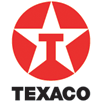
If you run out of geometric shapes to use for your logo designs, how about trying out such imposing symbols and shapes such are infinity and star. Take a look at how Fujitsu, Infinity Systems and Texaco(“the lone star of Texas”) have successfully integrated them into their logo designs.
So what do you think of the role Geometry plays in design?
Source:inspirationbit
Nice...really like this article
ReplyDeleteBeginning any design from basic shapes does helps us get the right design with good finish...nice article
ReplyDelete